9th March 2020

New Corporate Identity (CI) and new brand image campaign for Spuerkeess

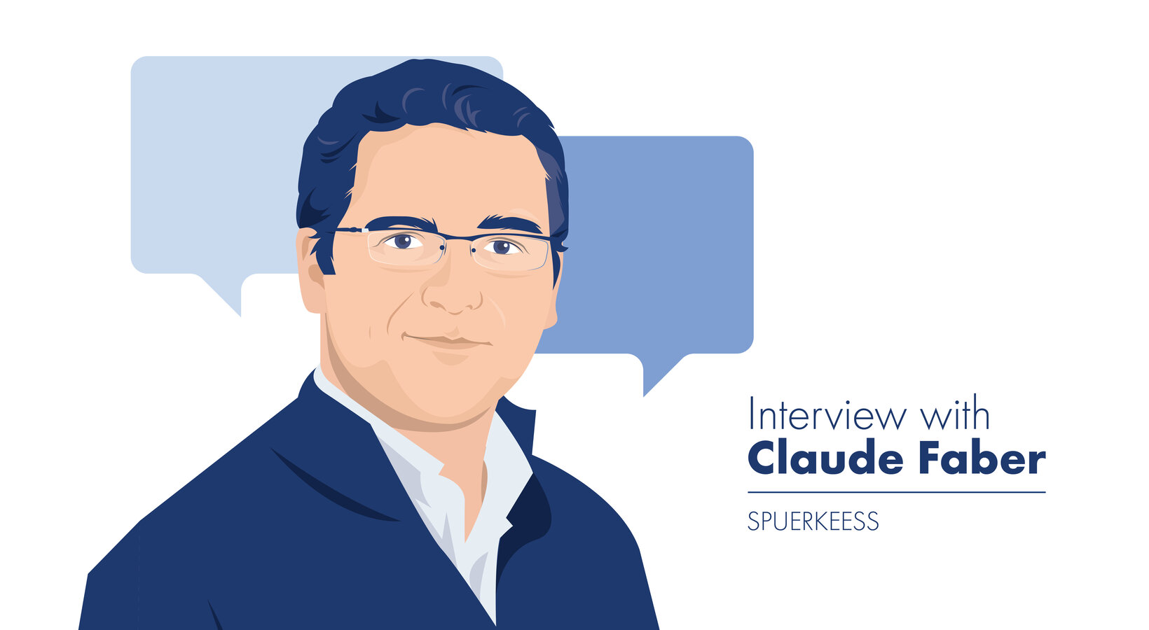
Interview with Claude Faber, head of communications in the marketing department, about the procedure for the elaboration of the new Spuerkeess Corporate Identity.

The doyen of Luxembourg’s financial institutions has rebranded itself after more than 30 years. What was your approach?

Before the launch, we sought the right external partner to support us. It is important to have an outside viewpoint in a rebranding exercise, because you lack the required distance. We very quickly came across BetoCee. They have sound references, an interesting methodology, and we got along well.

Then, we started with a blank slate. The Executive Committee gave us carte blanche, but with a taboo, the red square, and a premise, no revolution. An introspection exercise, based on interviews and workshops, enabled us to rediscover who we are.

Based on our "Brand Doctor”’s methodology, we thus determined the attributes of our brand, what makes us unique, the brand’s character traits, our value domain and our internal Leitmotiv. All this constitutes our "Brand Diamond”, which formed the basis of all the work that followed. We also had to get rid of our multiple personality, which was often a source of confusion, particularly among new customers. We therefore had to make a decision. Are we BCEE, Spuerkeess or Banque et Caisse d’Epargne de l’Etat, Luxembourg?

And who are you?

Today, based on our exercise, I can answer that question without hesitation: Spuerkeess! This is our trade name, which we will use in all our non-contractual communications from now on. Our corporate name, stated in our articles of association, will however remain “Banque et Caisse d’Epargne de l’Etat, Luxembourg”, and will continue to appear in our legal notices and in all our contracts.

Can you tell us more about this famous “Brand Diamond”?

The "Brand Diamond” is a guide and internal working tool that is not to be shared externally. The “Leitmotiv” is a vision that must be reflected in our daily actions. Our advisors should bring it to life in their interactions with customers, project teams must bear it in mind when developing new solutions and IT products… In short, once we bring it to life, customers will feel it naturally and we will not have to reveal it to them.

To remind ourselves constantly of this vision, we have introduced the “POP” spirit. In everything we do, we now ask ourselves the question: is it POP?

POP? Can you explain?

POP is an acronym for "Pleasant, Open and Proud” and is deviated from the “Brand Diamond”. It is not to be confused with the “Leitmotiv”, which… will remain secret! We have for example reviewed our sponsoring approach, and we have chosen five areas in which Spuerkeess wishes to invest as a priority. For each sponsoring request made, we will from now on ask ourselves the question, is it POP? In other words, does it reflect our brand’s personality and does it conform to our values?

And you have a new baseline “Your bridge to life”. Why did you choose a baseline in English?

Luxembourg’s demography and therefore our market are driven by immigration. Now, with new customers, we do not have the foundations we have with our traditional Luxembourg customer base. In the expat target market, we are not a well-positioned leader, but a challenger they don't know.

By opting for the trade name Spuerkeess, we chose to highlight our Luxembourg roots, so we consciously chose an English baseline to highlight our openness to the strategic target of expats. And it shows continuity with the former baseline “Äert Liewen. Är Bank”.

You have just launched an important cross-media brand image campaign. What is the take-away message there?

The campaign translates our baseline into images. Regardless of our customers’ project, whether in the professional or private sphere, we are with them and support them so they can realise their dreams. Spuerkeess is a facilitator that enables them to overcome obstacles and see their dreams through to their conclusion. We are their “Bridge to life”! The campaign’s focus is on our customers, their projects and their needs. But Spuerkeess advisors are never far away, they help deliver the project and share the customer’s joy. If the customer is happy, we are happy.

The brand image campaign is both the culmination of the exercise and the visible tip of the iceberg. Let me explain: the management asked us for continuous evolution, not a revolution. This in particular applies to the introduction of the new graphic charter. It very quickly became clear that we could not change everything at the same time and in a single operation. Given the volume of supports to be adapted, this would simply have been beyond our resources. Our teams still have work to do in the next few months: changes to signs, adaptation of S-Net and the website, etc.


Note that the management was very insistent that we avoided waste as much as possible, given our CSR, and instructed us only to replace printed supports when they were out of stock.

The Spuerkeess advisors in the film aren’t actors, are they? They are real employees?

Yes, indeed. We wanted to publicly recognise our advisors. It’s gratifying for staff, it perfectly reflects the POP spirit and in a country like Luxembourg, where everyone knows each other, it offers a real plus to the campaign.

We thus called for volunteers and organised casting sessions. For the advisors, it was also an opportunity to get away from their everyday business and do something really different.

You can see our colleagues’ motivation and the excellent atmosphere we enjoyed at the shooting in the film, which definitely conveys the strong positive emotions we were looking for. A big THANK YOU to all our actors and the whole SAMSA team! I think this 100% Luxembourg production is every bit as good as large international productions.

Why is music important? What prompted the choice of "I feel good”?

From the outset, we were looking for an iconic song that could reinforce the positive emotions of the film. With its words and the energy provided by James Brown, “I feel good” was a perfect match. It also makes you want to get moving and dance. As we had chosen dancing as a universal means of expressing joy for our film, we didn’t need to think about it too long when BetoCee suggested James Brown.

The song also has the advantage that it makes it easy to transpose the campaign to the radio, and just by seeing the newspaper advertisements or the bus shelters in the street, you immediately start singing the song in your head. I feeeeeeel good


Innovation